Article Summary: WatchTower IT Solutions turns three this November and is marking it with a new brand. Co-founder Tony Sollars shares how he and Rebekka knew it was time for a change and what it means for the businesses they serve.
Three years ago this month, WatchTower IT Solutions opened for business. By then I'd spent over twenty years in IT, running my own firms and working with Fortune 500 clients, so I knew exactly what kind of company I wanted to build.
We put everything into the work itself and the people we serve, and the brand was an afterthought. Since then, the company has grown up and the look hasn't. This month, we're rolling out a new brand that finally matches how we work.
How we knew it was time to rebrand
If you've ever wondered when to rebrand your business, our story might help you spot the signs.
When we launched, the brand wasn't something we planned. I picked colors quickly. We never chose a brand font. Our logo cost $99, and a high school student designed it. That was fine for getting off the ground, because our attention was on clients, not the look and feel.
As we grew, the problems got harder to ignore. The logo had so much detail that it didn't hold up at smaller sizes or in certain uses, like stitching on a polo shirt. We also didn't have a wide version that worked for the website. And it looked like what most IT companies use. That's fine, but it's industry standard, and it didn't say anything about who we are.
What three years in business have taught us
Rebekka and I started WatchTower because small and mid-sized businesses deserve the same caliber of IT support big companies get, from people who know their names. We've held true to that idea, but the way we work with people has changed.
By now, we've gotten a lot clearer on who we really are; we're relationship people. We care about pouring into the folks we work with, and we care about doing the right thing, even if it means sending business elsewhere. Then we looked at our branding, and none of that was in there. I didn't know colors and a logo could say any of that. Turns out they can.
We've started attracting clients who care about the same things. That tells me the message is getting through, and now the brand says it too.
For Rebekka, the rebrand meant something more personal. After a decade as a Marriage and Family Therapist and five years directing a preschool and kindergarten program, she went all in on WatchTower in June 2024.
"At the beginning, I was stepping into an industry I didn't know," Rebekka says. "I didn't know who we were yet, so the original brand never really felt like mine. This time I had real experience to bring, and I had a real say in it. When we finished, I could finally look at it and say, this is who we are. Not who I'm agreeing to be."
What's staying the same
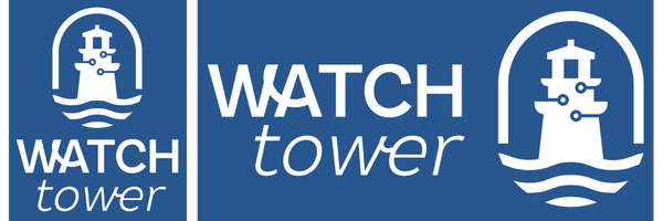
The name stays, and so does the story behind it. WatchTower came to me in a dream: a watchtower, a lighthouse, standing guard and casting light into dark places. After a lot of prayer and reflection, neither Rebekka nor I could let it go.
That image is still at the center of everything we do, and the new design leans into it.
Our promise to clients isn't changing either: when you call, someone answers. If you've worked with us, that part won't feel new.
What's getting more emphasis
The new brand puts what we actually care about up front. Relationships come first. We'll tell you the truth, and if you ask what our markup is, we'll tell you that too. We plan ahead so problems don't sneak up on you. We take security seriously because the stakes are real. Every year we pick a nonprofit and support them for free. And we keep things clear, so you always know what's happening and what it costs.
A palette from right outside our door

Our new colors come from right here in the Pacific Northwest: evergreen forests, the teal of a mountain lake, and a sunrise. They're called things like Evergreen, Teal Tide, and Sunrise. The idea is calm and steady, with some warmth in it. That's how we want clients to feel when they work with us.
The new font is called Modo. It's clean and professional, but it has some personality, which fits. There are real people behind this logo.
We live here and our clients are here, so it made sense for the brand to look like home.
What this means for you
If you're a client, your service doesn't change. What changes is that our values now show up everywhere you see our name, and we expect you to hold us to them.
If you're still looking for the right IT partner, the new look is a pretty good preview of what working with us is like. We care about your business as much as your technology.
Thank you, Megan
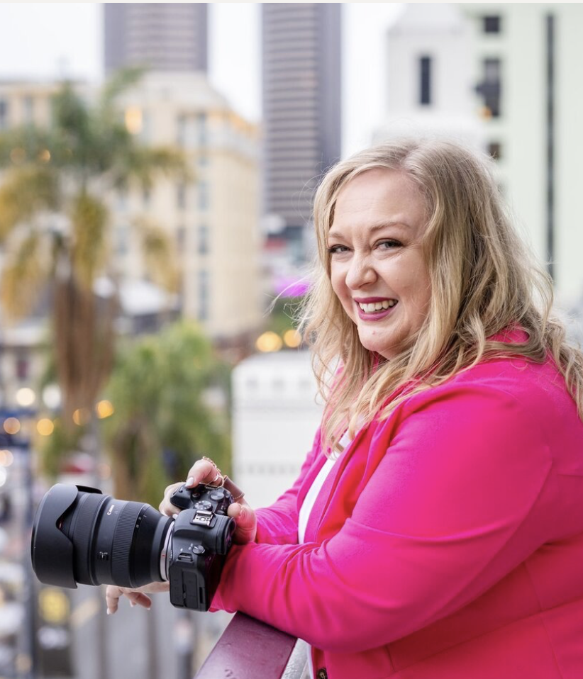
We owe this brand to Megan Sethia of She Plays With Fire, and Rebekka met her by chance. She was at dinner with a few people after a FAB (Femme Allies in Business) meeting when Megan described a branding package she'd put together for another business owner. Rebekka asked if that offer might be open to a business like ours. It was, and the timing could not have been better. Rebekka and I had already been talking about how it was time for a change.
Branding two business partners isn't easy. It's like trying to fit two people's design styles into the same house. Megan did the deep work of figuring out who we are and found something that fits us both. Rebekka calls her a genius, and I agree. If your business is ready for a brand that reflects who you've become, sign up for Megan’s newsletter here and get her free “7 Essentials to Set Your Brand Ablaze” resource.
Here's to what's ahead
To our clients, vendors, and partners, thank you for your support. A lot of you trusted us early and sent your friends our way. We don't take that lightly.
We'd love to hear what you think of the new look. Head over to our brand reveal LinkedIn post and tell us in the comments, or give us a call. Someone will answer.